Samuel Gompers Website
Case Study
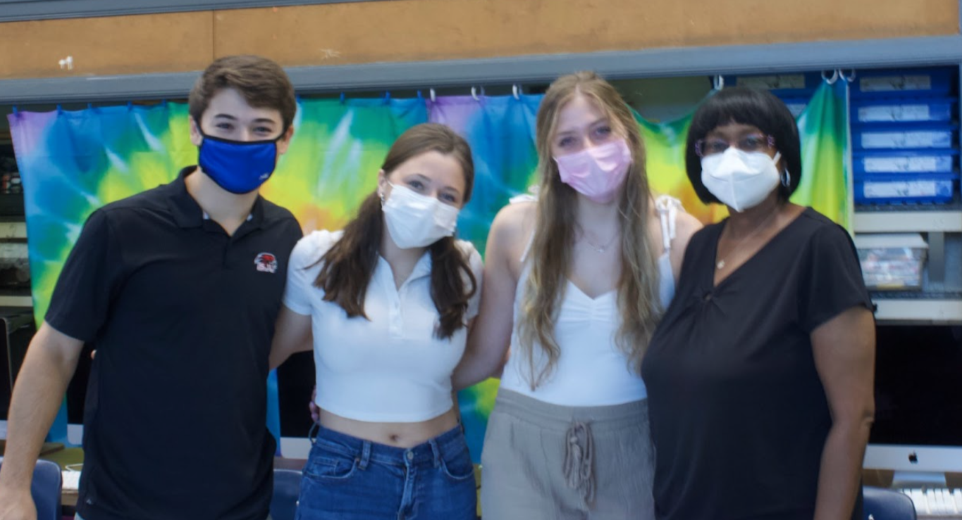
Fellow: Madison Mancino
Team: Gabriella Guzzardo, Caitlin Reistle, Timothy Sharpley, and Edmund Corvelli
Community Partner
We partnered with Samuel Gompers school to renovate its website to make it more accessible and engaging to its many stakeholders. Samuel Gompers is a K-8 public school that caters to every student that walks through their doors. At Gompers they believe all students should be catered to, empowered, and valued. Gompers specializes in several in-school and afterschool programs that cater to students' needs and wants. A strong value and emphasis on a good education that is catered to each individual student is Gompers speciality. Updating and adding photos onto the site also brings the school’s culture and community to life. Seeing the student’s bright faces and timely photos of the campus show off the school in the most professional way possible. Displaying Gompers as a community member and school gave Gompers a fresh start and made theri online media presence stronger and more lasting.
Challenge
When going into this project, our overarching goal was to give the Gompers community a website that would clearly and effectively communicate why they do what they do and how they do it. Before we got to work, the website needed updating and reorganization. Part of achieving our goal was organizing and redesigning the existing website (gompers.philasd.org) to reach Ms. Rivera and Rennie Parker’s ultimate goals for the outcome of this semester's work. The additional aspect was collaborating and taking into consideration these goals, ensuring that we conveyed their suggestions into physical elements on their website. The most difficult challenge we faced throughout this process was the time restraints we had to be hands on and edit the website to achieve these physical elements including editing tabs, spotlight, images, documents, dates, and various other forms of content. Each week we learned how to be purposeful with each element we modified, and used the information we received from Ms. Rivera to place each piece of content in the most effective location possible. Using a trial and error process to see what worked the best for the Gompers website as a whole ultimately gave us a very successful conclusion to this project.
Strategic Thinking
As we worked with our community partner, we had a limited amount of time to make changes and revisions to the website. We met with Ms. Rivera once a week on Friday at around 1:15. The meetings usually concluded around 1:45. This might have been a setback for some groups, but our team performed well under pressure. Meeting just once per week gave the group time to brainstorm ideas when it came to design and content for the website. As we approached each meeting, the group comprised a specific agenda with goals we wanted to achieve. The group then collaborated with Ms. Rivera, we explained to her what we wanted to get done, and she gave us the resources needed to achieve these small weekly goals. Only having approximately thirty minutes of work time at each meeting forced the group to work efficiently without even having the possibility of dragging our feet with the work.
Results
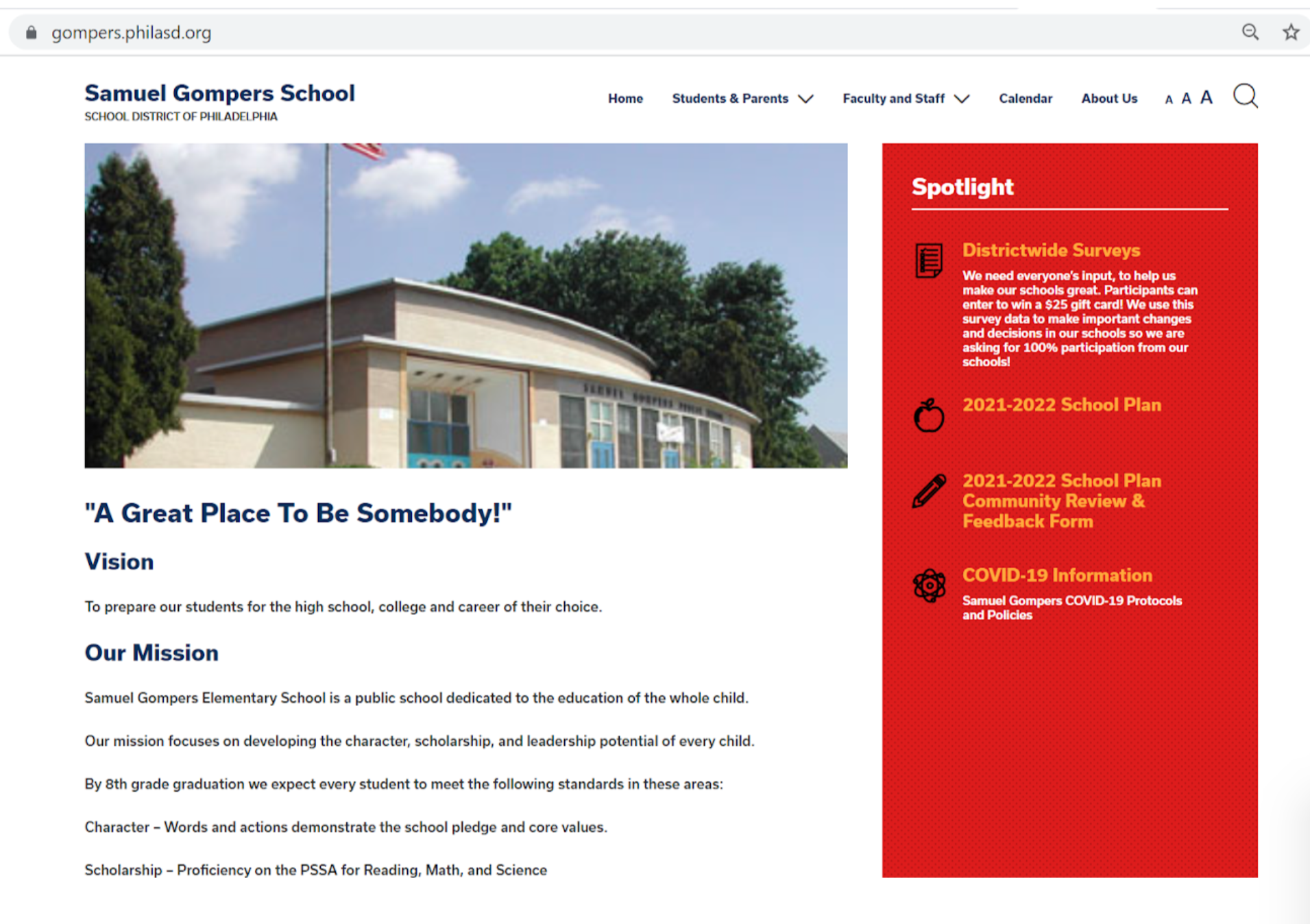
As we collaborated with Samuel Gompers School website we have created a lot of good results when helping out with their website! The one main focus that the group was trying to make better was the organization of what was within the spotlight section and what each tab had under each of their names. We helped them highlight their vision and mission statement on their site by putting it right under their image of the Gompers School and made it noticeable and easy to read for viewers. We noticed in the beginning that there were sections on the site that were shown in both the spotlight and the tabs section, which was unnecessary to have two places for one link. So we made sure that all the important information regarding District Wide Surveys, 2021-2022 School Plan, 2021-2022 School Plan Community Review & Feedback Form, and COVID-19 Information was presented on spotlight because we felt that these were the most important sections for parents and visitors should look at once visiting the site. Anothing part was originally a lot of links were shown on the spotlight section that were unnecessary to have under that section so we had to move certain links to the tabs sections so all information regarding the school would be under the tabs section which is easy for users to view. We would support their social media pages by emphasizing what platforms they were using to post information and school activities on their media pages which they did a great job with. Their Instagram and Twitter pages were looking amazing and on the right track. One thing that we weren’t able to fix in time was the quality of some of the images that were shown on their site, some we were able to change and fix but a couple we were not able to change in time. Overall, their main purpose was to make the site clean, easy to view, organized, and have access to important information regarding the school and parents' kids within the Gompers School.


